Analyzing and addressing nonprofit organizational needs
Client:
Industry:
Social Impact & Philanthropy
My role:
E2E product design and usability testing
Product medium:
Web-based desktop and mobile app
An automated and guided assessment tool to help nonprofits understand their most pressing needs and recommendations for how best to address them.
View the blog article here that our team wrote about the products goal and process.
Client:
Catchafire is a marketplace that connects nonprofits and volunteers on remote volunteering opportunities. Nonprofits select from a menu of pre-scoped projects to post and volunteers apply to listings matching their relevant professional experience.
Challenge:
Historically, Catchafire’s customer service team conducted individual surveys to help nonprofits onboard to the platform and understand their organizational needs. This process was time-consuming, failed to accurately represent the current offerings, discouraged platform discoverability, and prevented Catchafire from gathering insights from nonprofit responses in a resourceful and quantifiable manner.
Objectives:
A tool that more efficiently and asynchronously onboards and guides nonprofits to understand their needs, while educating them to Catchafire’s platform services.
A scalable solution to provide visibility to the rapidly evolving project marketplace and various product offerings.
A swift and recurring way to gather data about what nonprofits are looking for, to then inform how we could better serve their organizational initiatives.
The product teamAri T. (me!)
UX + Visual lead
Kate V.
UX Director
Nava F.
Product Manager
Josh H.
Full-stack Engineer
Jose P.
Back-end Engineer
Naeem S.
Front-end Engineer
Product process and outcomes
•
Product process and outcomes •
Step 1: Crafting the flow and framework
Figma
Product design concept and wireframes
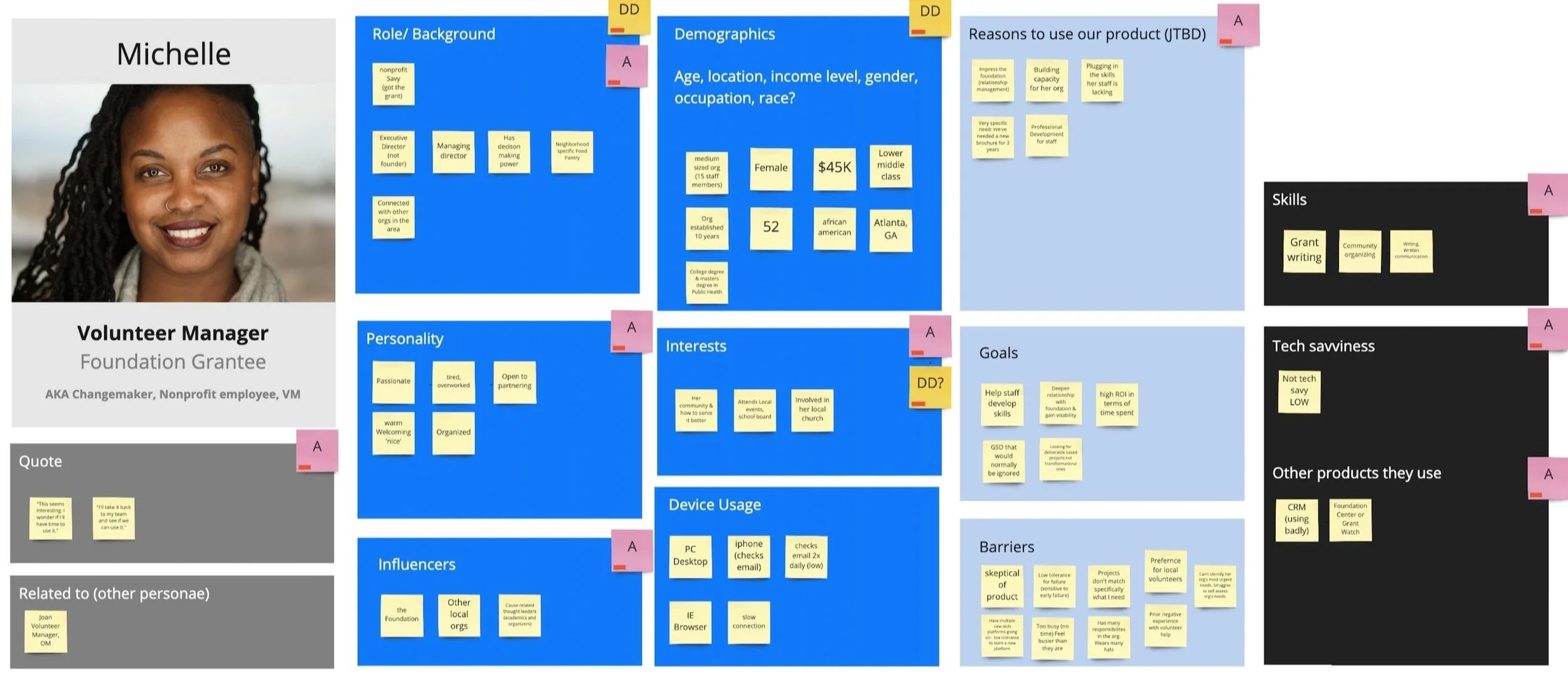
Miro
Whiteboarding user types and journeys
Notion
Documenting project plan and strategy
Understanding our audience
While Catchafire was a dual-audience platform, this product would be specifically crafted for our “Volunteer Managers,” the people who worked at nonprofits that were seeking help from volunteers.
Serving first as an onboarding and education tool for new users, it should be used to provide ongoing support for Volunteer Managers to refer back to understand how their needs could be adressed with the opportunities available on Catchafire.
Getting the team aligned to a path
We weren’t completely starting from scratch; this project was very much streamlining and innovating on a workflow that existed in real life. Because of this, there were a lot preconceived ideas flowing across team-members and stakeholders on what we could do with this tool to aid nonprofits. But we needed a realistic and achievable place to start.
I created a baseline user journey to guide us (informed by the survey that this tool would replace), and held workshops were we continued to iterate and build from the basic flow.
I used Miro a lot during this process as a collaboration and white-boarding tool for facilitating and moderating workshops, and building out various user journeys.
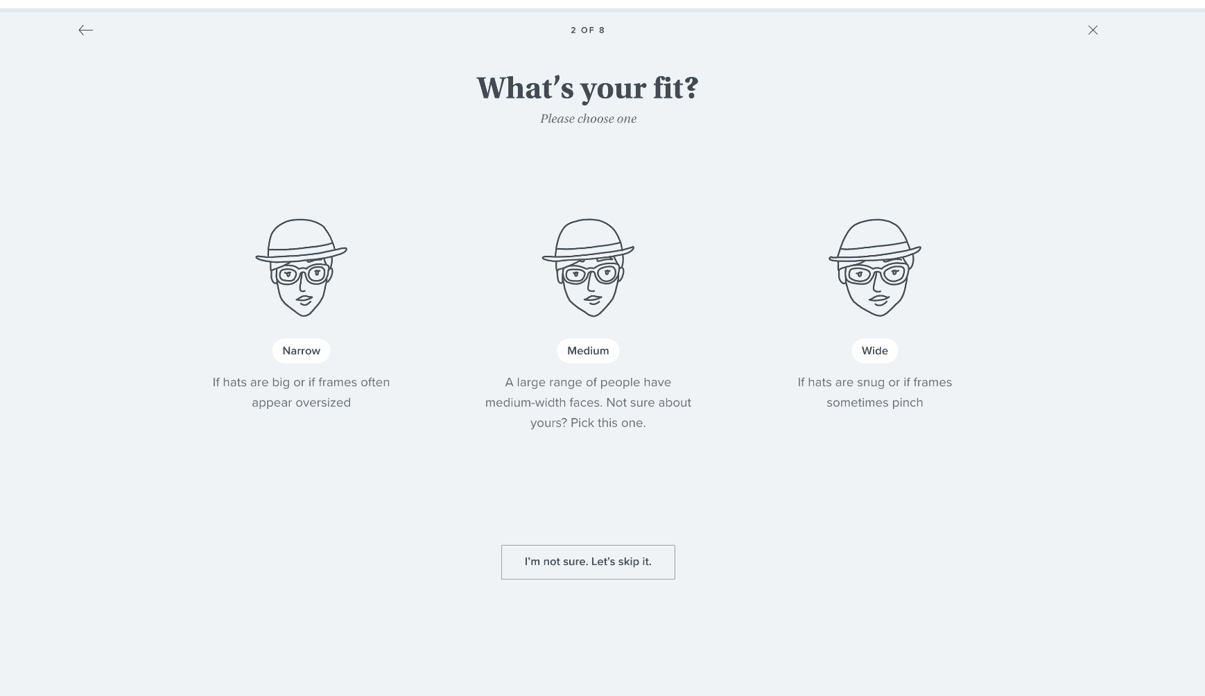
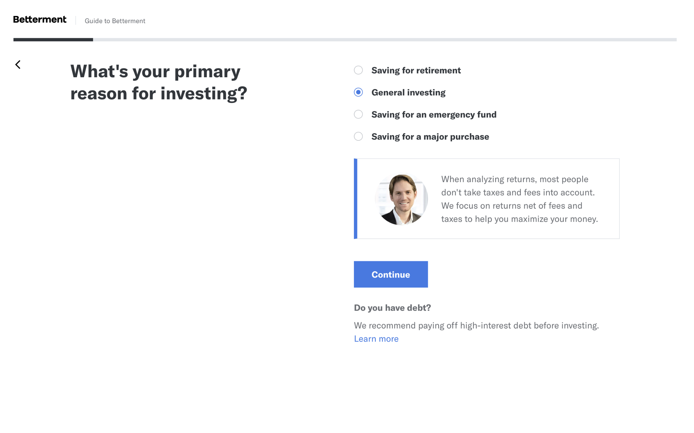
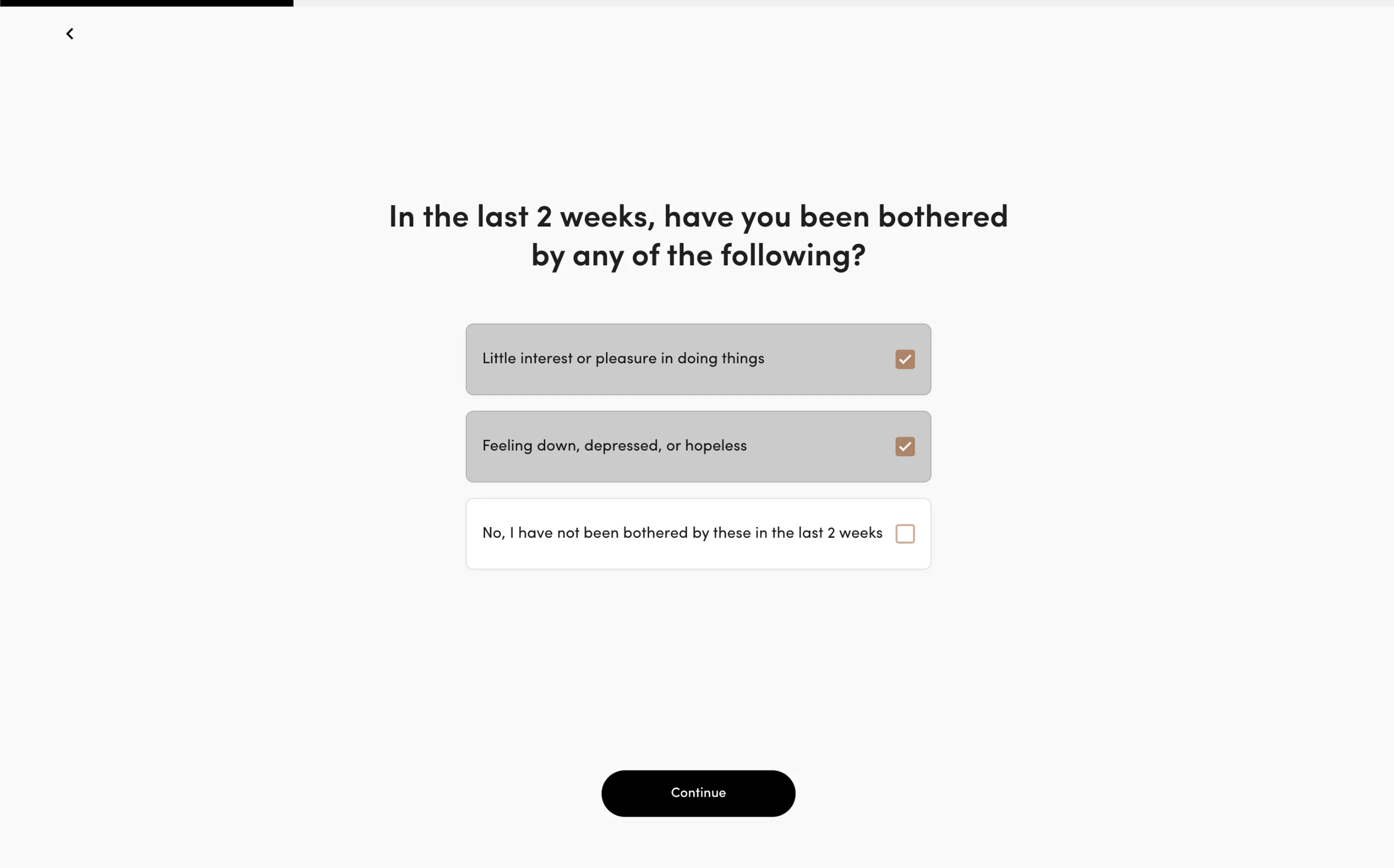
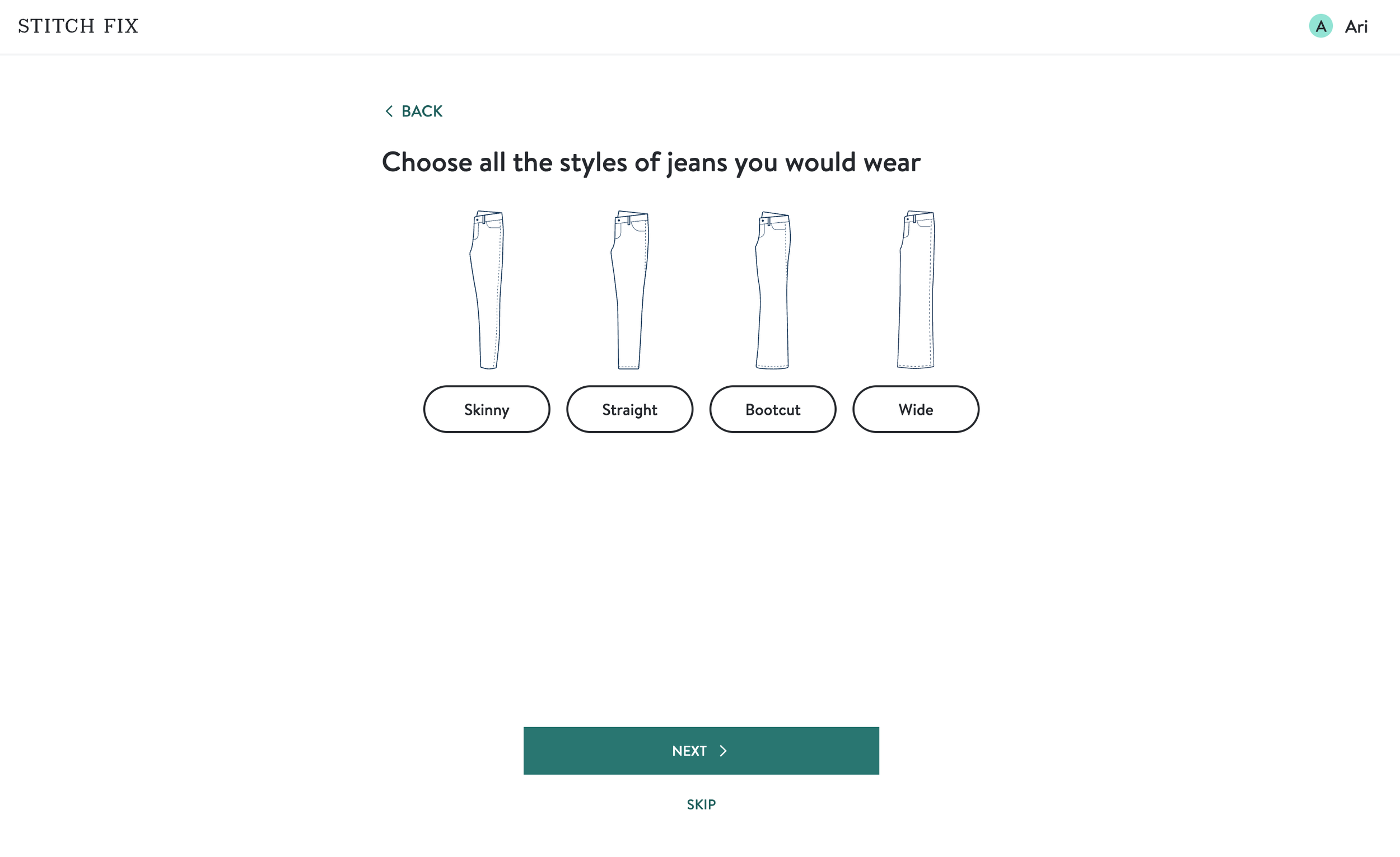
Benchmarking similar products
After finalizing a flow that felt right for our goals, it was time to seek inspiration.
With the quiz was well-established within the industry, so we had ample examples to learn from.
Patterns observed:Context of progression
Simple, straightforward language
Context for clarity, when needed
Subtle visuals for playfulness and pacing
Consistent layout and structure
Laying out the groundwork
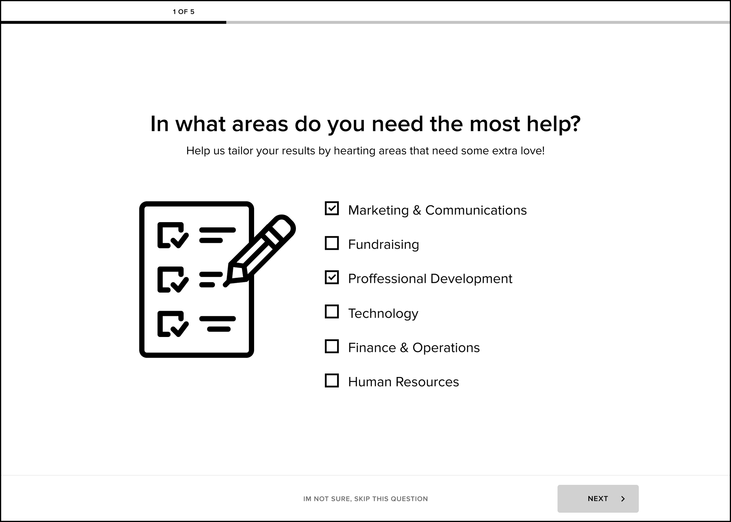
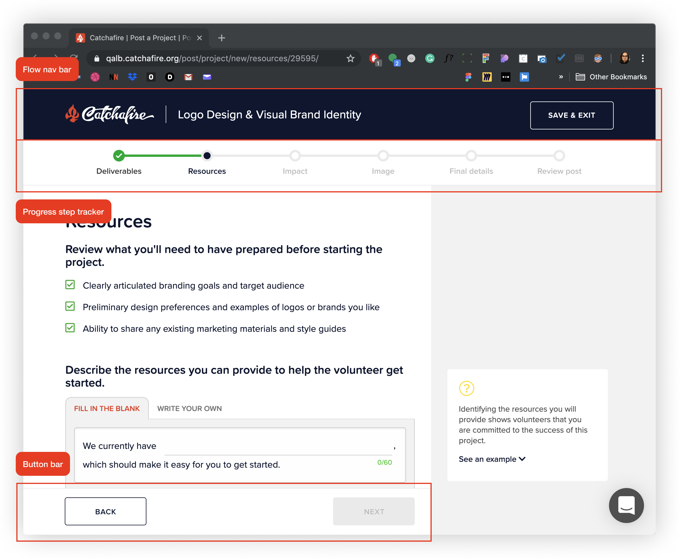
Drawing from the workflow we outlined, I wireframed key pages to get tangible grasp of the user journey, the narrative of the copy, and structure of the layout.
Key points:Length of content and complexity of language should be easy to understand and not filled with jargon.
Should be able to be completed efficiently and quickly. The “volunteer manager” user is already resource and time constrained in real life.
Optimized for our 'dizzy' users who require heavy guidance and clarity. We affectionately referred to them as 'dizzy' due to their confusion and struggles with technology. They comprised a large part of our “volunteer manager” user base.
Users should know where they are in the process at all times and able to save their progress to finish later.
Easily translatable to mobile.
Option for continued personalized help from our customer service team.
Step 2: Testing the concepts
Confident in the direction of the flow and framework, we were ready to test with real people for usability and desirability.
My responsibilities during research:Create test plan and objectives
Build test prototypes that allowed for conditional logic
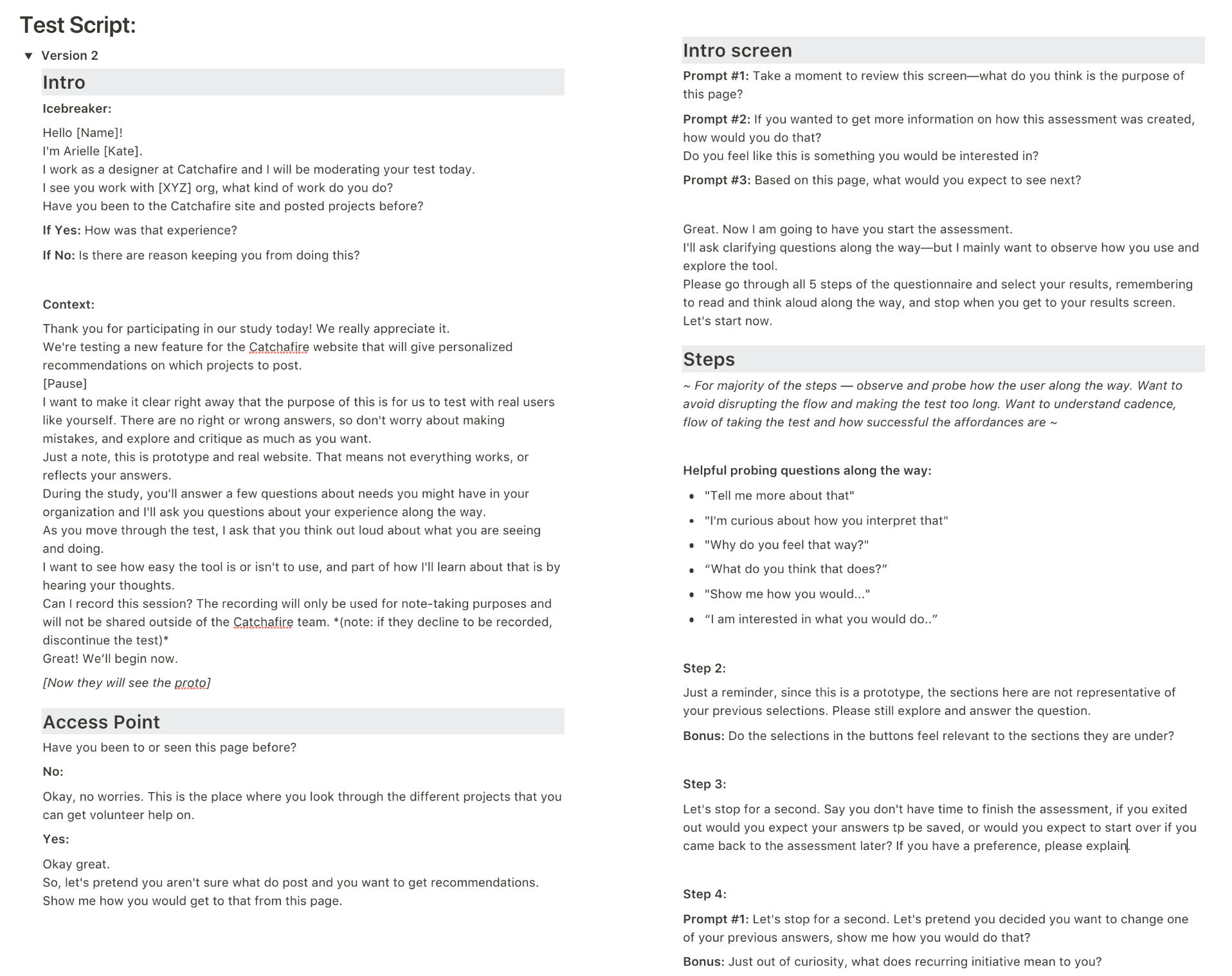
Write script for test
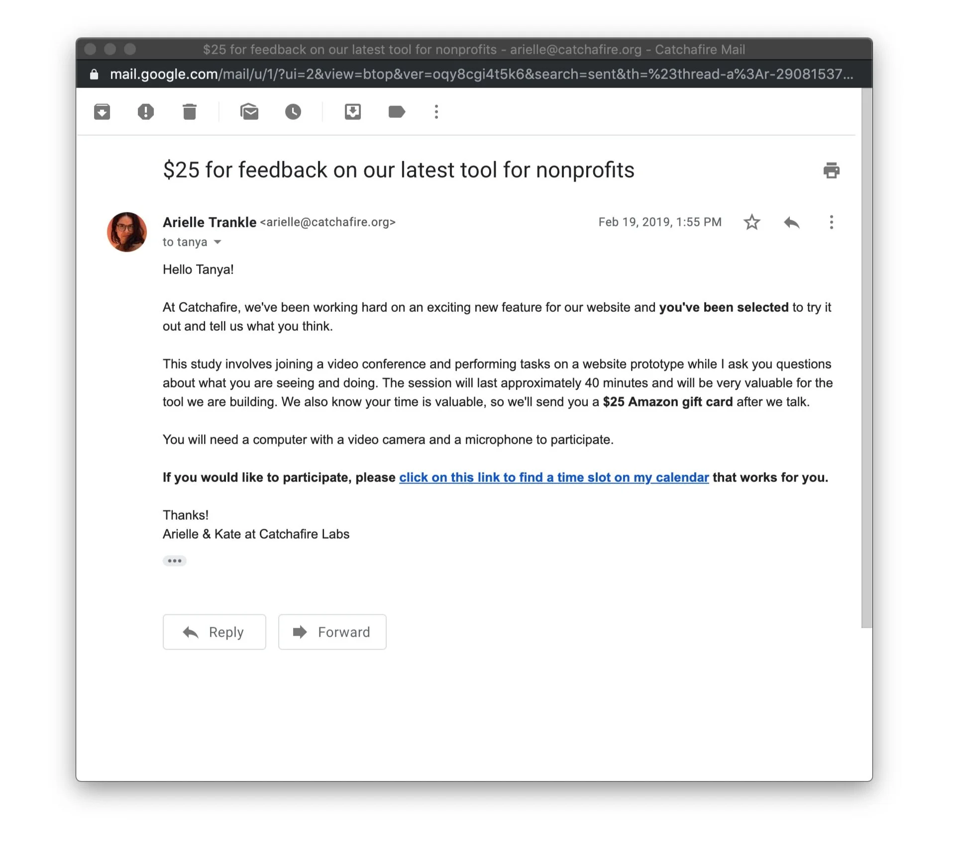
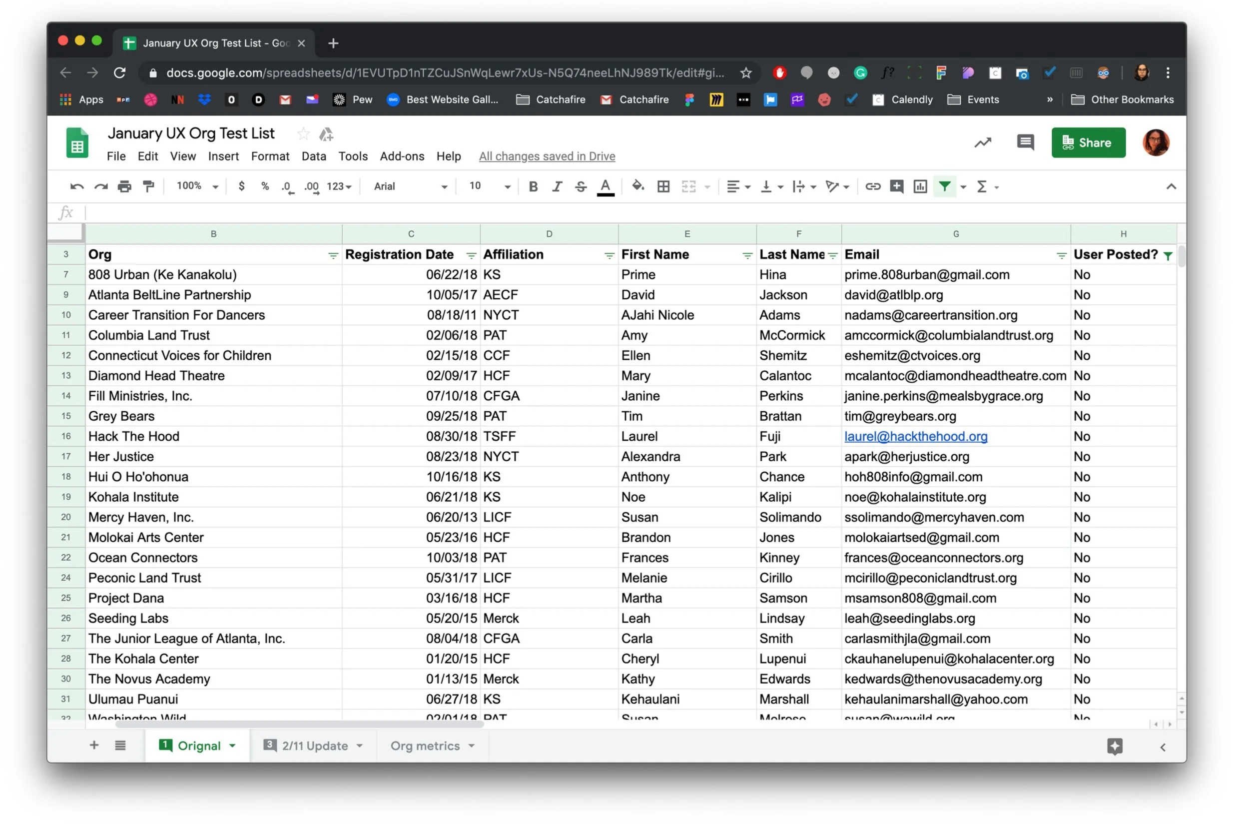
Recruit test subjects
Moderate and conduct user tests
Take test notes and analyze results
Amend ux/design after testing results
looking to validate with users:Knew what to expect when starting the flow.
Felt confident to move through the flow with ease; that the steps and language were not overly verbose or filled with jargon.
Found the questions relevant to their organizational needs and tasks.
Received education about the different offerings available on the Catchafire platform.
Understood how move forward with posting and saving projects, and how to receive additional personalized service if needed.
Figma
Product design mockups
Axure
Full functioning prototypes
UserZoom (formerly Validately)
Testing and recording sessions
Google Sheets
Session note-taking
Notion
Test plan, script and results
Calendly
Invites and session logistics
Finding our users and putting together the testing sessions
Format:45 minute test sessions on desktop, moderated by me.
Features tested:Access point on project menu page
Assessment flow
Recommendations page
Post-flow assistance questions
Participant criteria:15-10 new and existing volunteer manager users (to gauge on-boarding capability), of any gender
Age range between 25-65 (targeting at least 5 people 50+ since majority of our volunteer manager audience is in this range)
International + US Based (content needed to be easily translatable because our user base was global)
Example excerpt from test script:
Building out a base design for testing
The user test goal is to inform the usability and structure of the experience. To run the test effectively, we needed a prototype that felt authentic to the brand and allowed us to test out potential new design components.
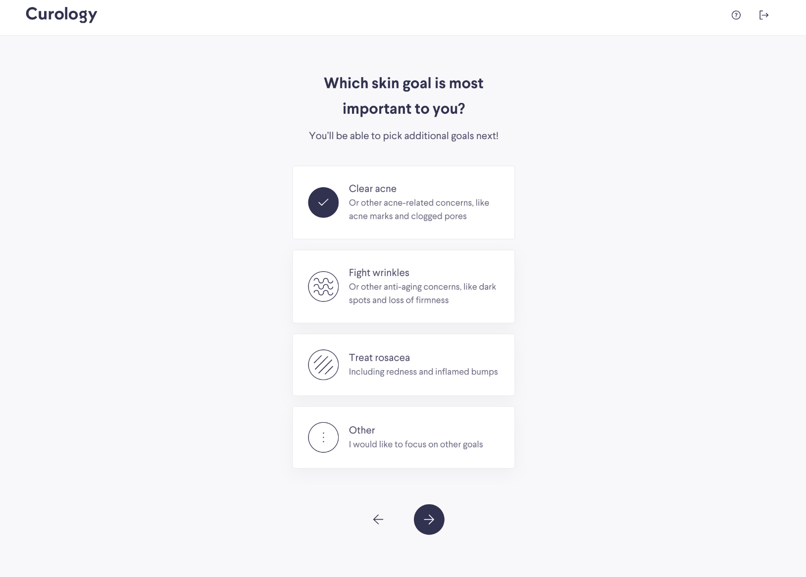
Majority of the design was built from our existing design system component library, as well as the visual styling patterns. Some exceptions were required, such as a new multi-select and slider component, and illustrations to accompany the question text. We will come back to this later in the process!
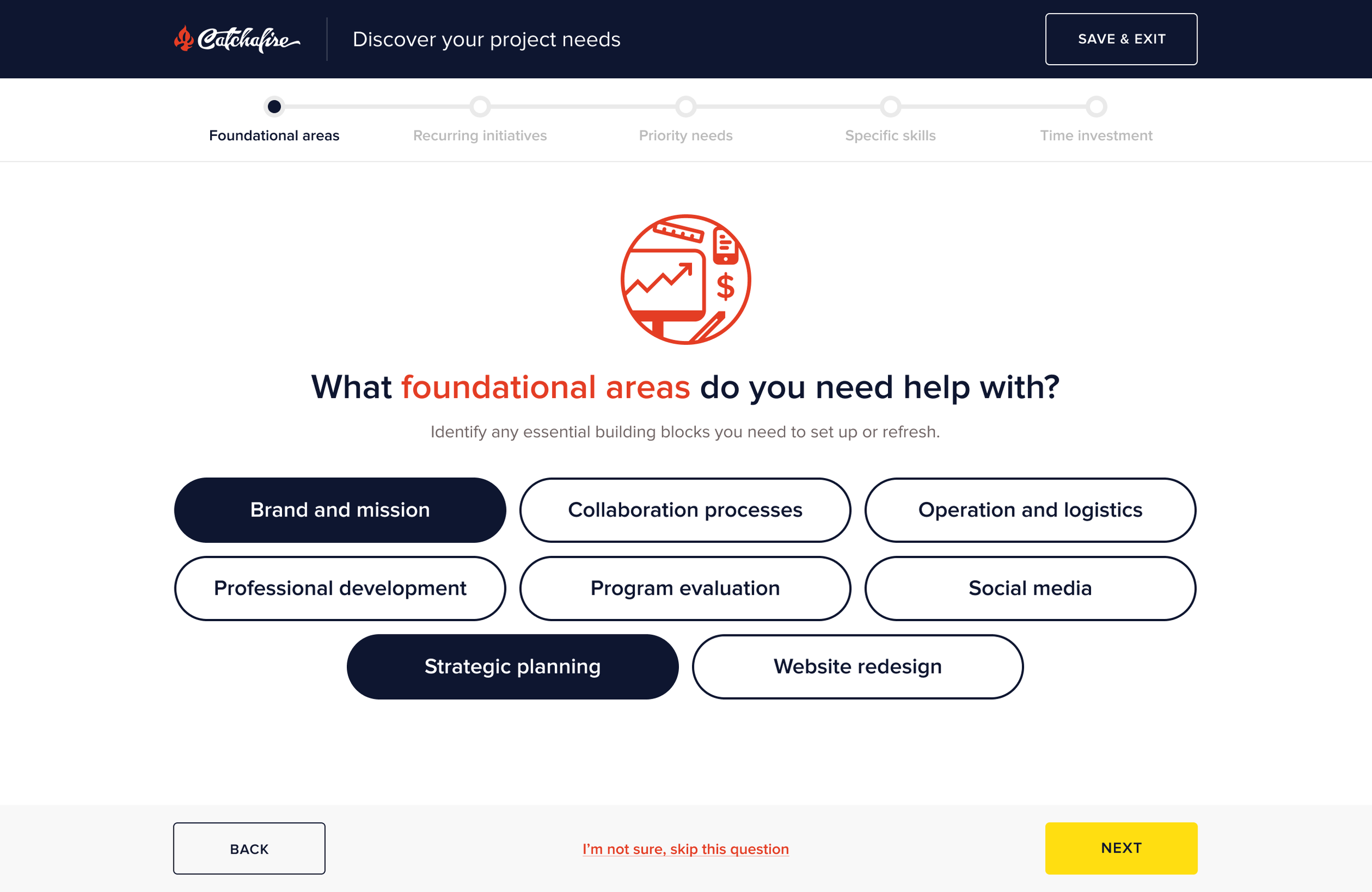
Sample prototype screens (screen designs reflect closer to what was built than what was tested, will have the correct screens up soon!)
Conducting and analyzing the user test sessions
All in all, users responded positively to the assessment and were able to move through swiftly and with minimal confusion.
Participants tested:11 test subjects (9 female identifying, 2 male identifying)
Ages 29-48
9 of 11 users had posted on the platform before
All US based, but couple speak a variety of languages
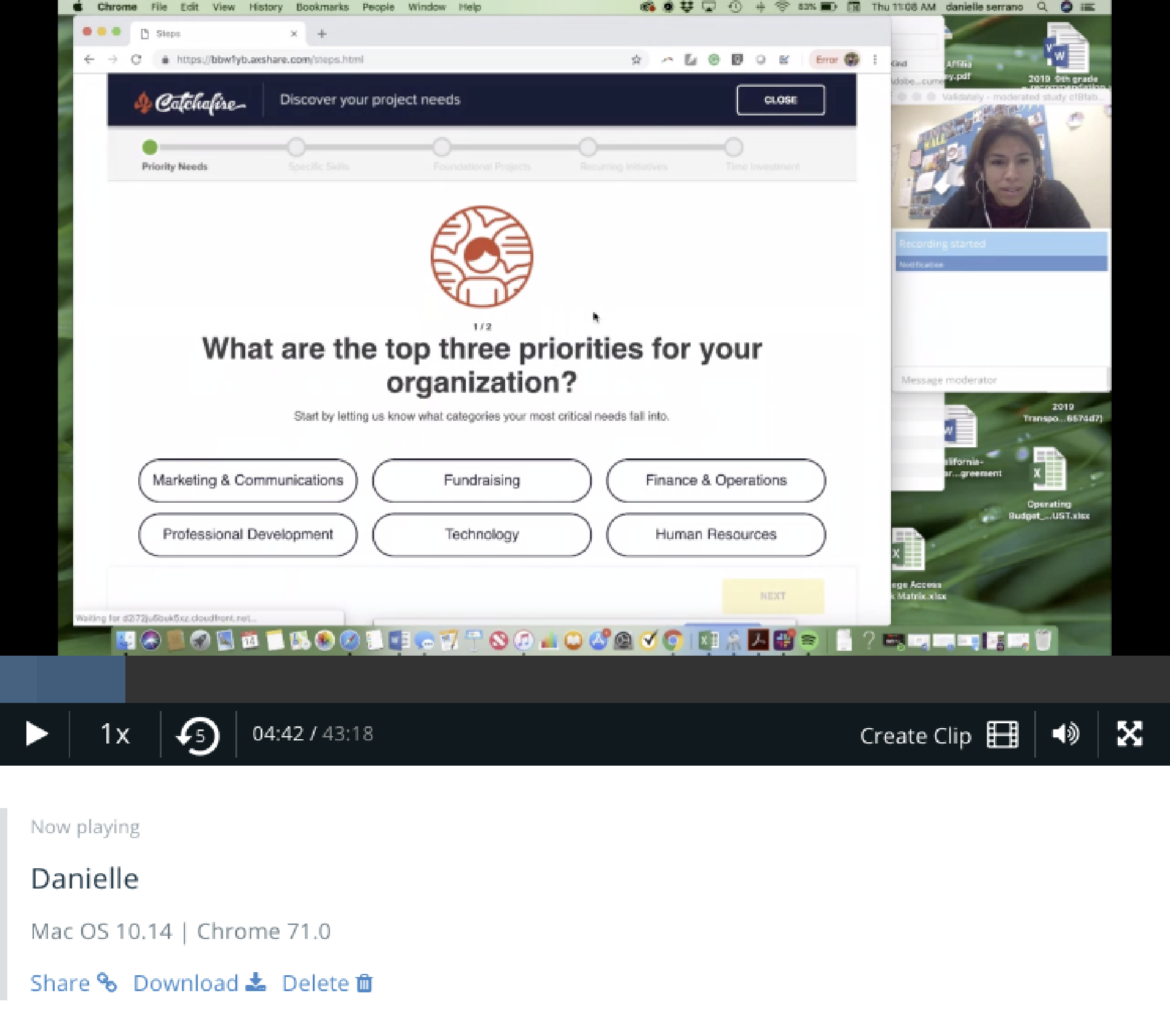
Screengrab from test session with user sharing their screen via UserZoom
Testing learnings:
Users saw the assessment as an extension of filtering and browsing, similarly to what they do on the site, and saw a strong connection in language.
Users were satisfied with the results and organization of recommendations (including the quantity, layout and wording) and understood the progressive order of the listing types.
The tool is successfully educating users about Catchafire’s offerings (i.e. learning about the listing types, the concept of bundles and the presence of Catchafire’s customer service/nonprofit advisor team).
The complexity of language used was easy for users to grasp. They also didn’t feel overwhelmed with the time-commitment or amount of content.
“Everything is intuitive.”
“Self-explanatory, easy, doesn’t take a lot of time.”
“Simple questions... simple solution.”
Design remediations:
It should be obvious that answers are being saved
Users were not confident that if they where mid-way through the flow and left if the results were being saved or not. They also weren’t sure if they would still have access to the recommendations that they didn’t save at the end of the flow.
Framing of questions should go from broad to specific
Users felt like they were constantly context switching between questions relevant to their individual work needs or needs of the organization at large. This led to a lot of confusion of how to effectively answer the questions.
Add the ability for users to provide free-form info
For the extra personalization flow, users wanted a blank field to give relevant context to their specific and potentially complicated needs.
Add clear way to get back to recommendations
Many users expressed wanting to go back to their results after closing the recommendations or getting additional personalize help, to see if they might have missed something, but weren’t sure how.
Step 3: Designing the experience
After analyzing the test learnings, we swiftly implemented the changes and began finalizing the design feel.
The design largely remained close to the initial mockups, with some restructuring of the questions, and providing users with more clear actions and way-finding.
Figma
Product design and design systems
Principle
Interaction design prototypes
Adobe Illustrator
Illustrations
Minimal • Focused • Delightful •
Minimal • Focused • Delightful •
Structure is designed and built for scale and repurposing
As the platform evolved over time, we needed to make sure this could easily be edited or changed as our language and offerings did.
Just as important, we wanted to ensure that this format could be used for other projects and initiatives that would value from this framework
Content, presentation and interactions should be digestible, minimal and focused
A big portion of our users were not fluent in using technology and we had an international audience. We didn’t need for things to be overly complicated, and after-all our platform was for servicing others effectively and promptly.
Nods to the real people behind the tech and services
Our customer service and nonprofit advisor team was a key industry differentiator to the company and platform. As Catchafire's services became more automated, we wanted to highlight how the initiatives were informed by industry experts with direct experience in social impact and nonprofit sectors.
Easily translates to mobile
Sounds obvious, but in the past mobile was an after thought or not even considered. Components and structure was design in tandem with considering different device mediums.
Leveraging existing patterns and structures
Majority of the components and styling already existed in our design system, and though the format of the “quiz” was new to our platform there were existing flow structures from the “project posting” flow we could pull from.
Not only did this help for development circumstances it was a framework our user type was already accustomed to.
Creating new components
While brand new features tend to require new components or variations we made sure to spend time on additions that were high value and repurpose-able.
Multi-select button
While our system had multi select check-boxes they were not a substantial and obvious target, nor were they appropriate for the large layout of the design.
Component rules:Buttons have a fixed width, but adjust fit within columns.
If only 1 option is meant to be selected, selecting that button will auto-progress the user to the next question.
Height is fixed and button text should wrap within
DefaultHoverDisabledSelectedSelected (special)Slider
Our design system didn’t have a component that supported selecting a range. Simplicity of the design was inspired by Google Material.
Component rules:User can make their selection by either grabbing the node and drag it across the slider, or clicking on a specific tick mark.
User cannot choose a middle point between the hour marks. Node will snap into place of whichever tick mark is closest.
All interactions of movement have an ease transition to them, rather than being immediate.
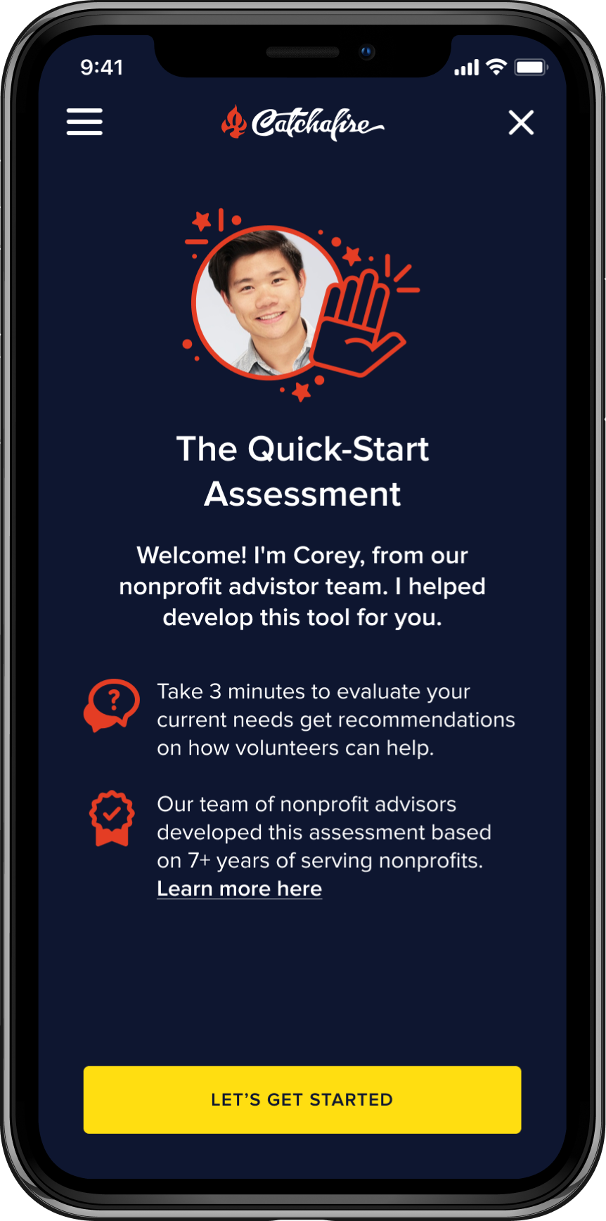
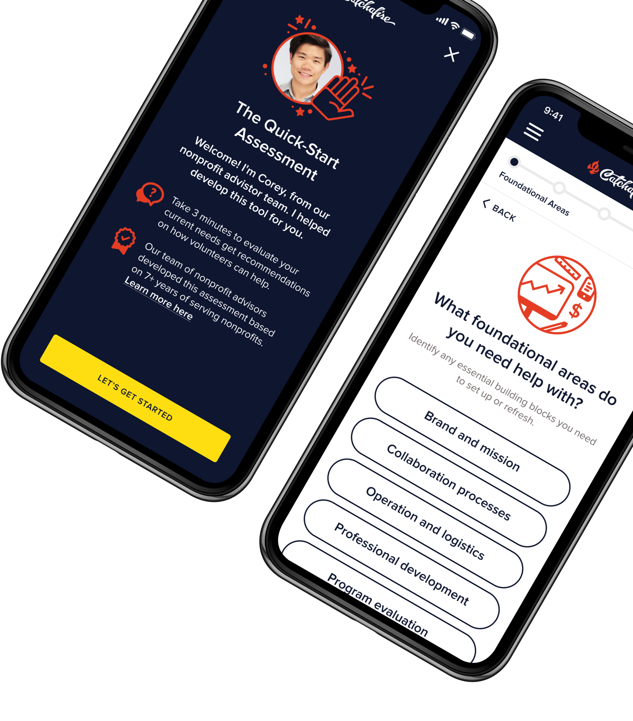
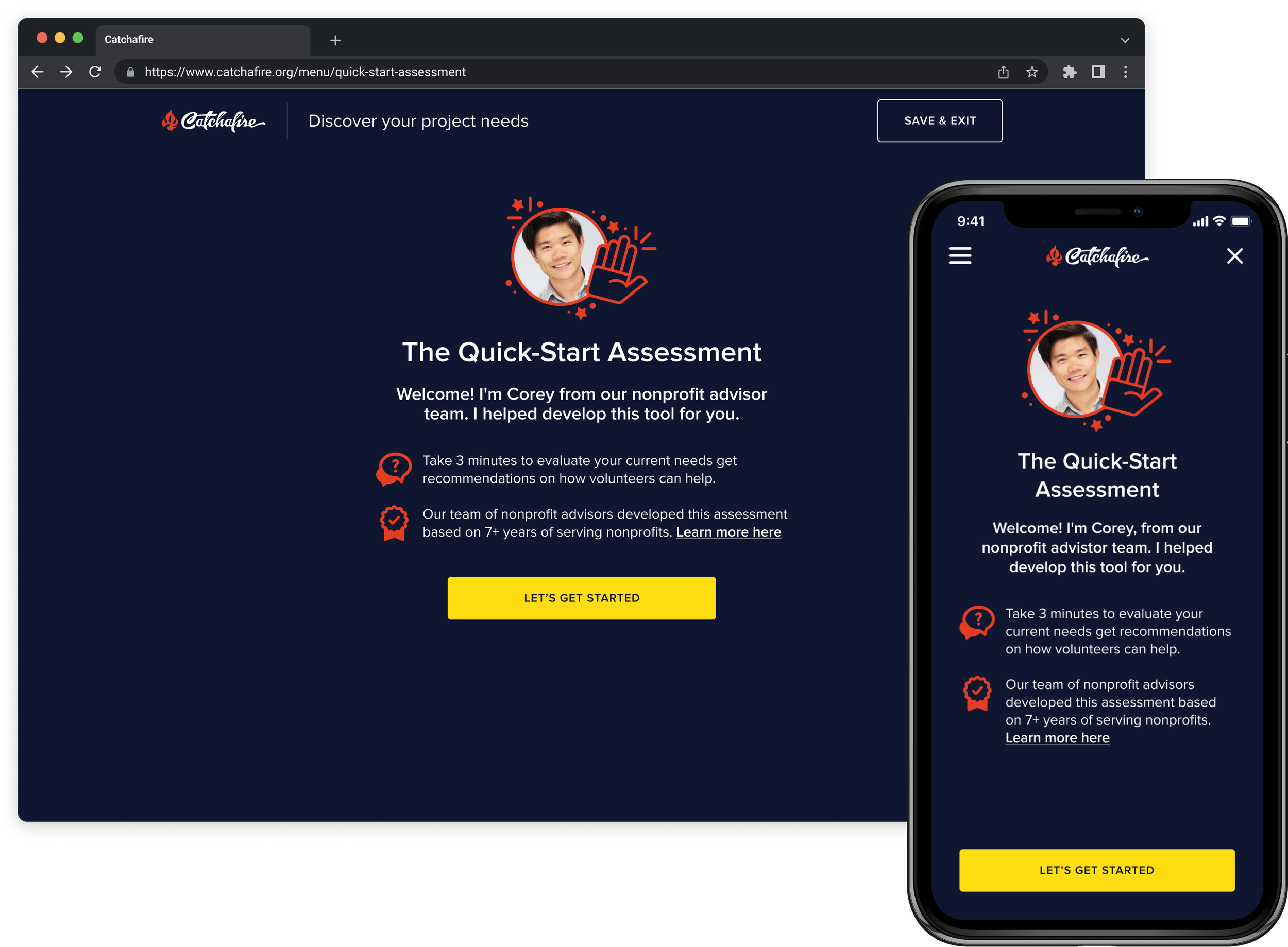
DefaultHover over rangeSelected rangeHover over selected rangeIntro to “The Quick-Start Assessment”
DESIGN CONSIDERATIONS:Setting expectations for what the user is committing to
Communicate that it is a personalized experience
Provide credibility by hinting at the real humans behind the tech and their expertise
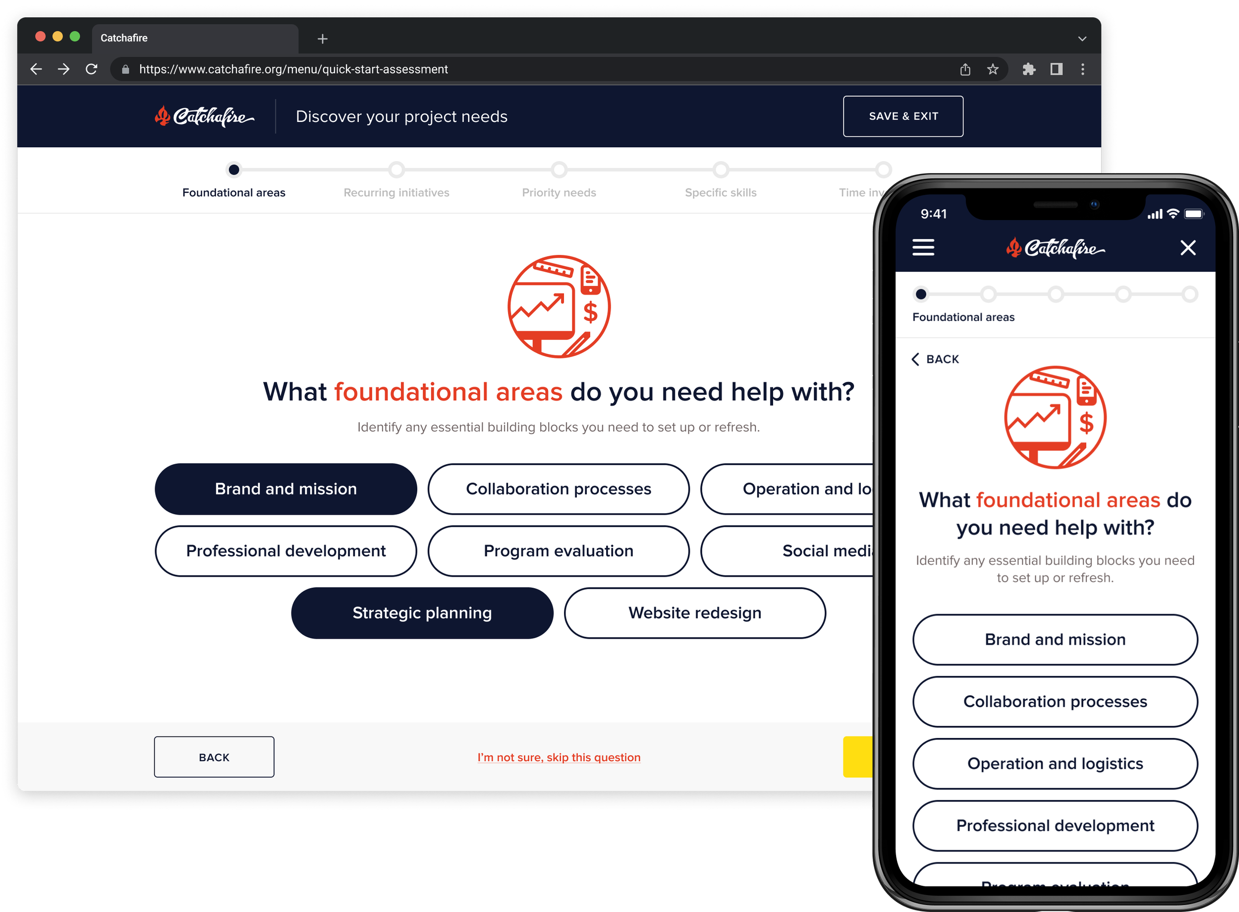
Identifying nonprofit needs and priorities
The bulk of the flow consisted of a 5 step questionnaire learn about the volunteer manager’s specific responsibilities, as well as their nonprofit.
DESIGN CONSIDERATIONS:Clear hierarchy, clean design, and digestible amounts of content
Obvious affordances focused on questionnaire tasks
Illustrative elements to add context and delight
Prototype and video to show the interaction of these screens is coming soon!!
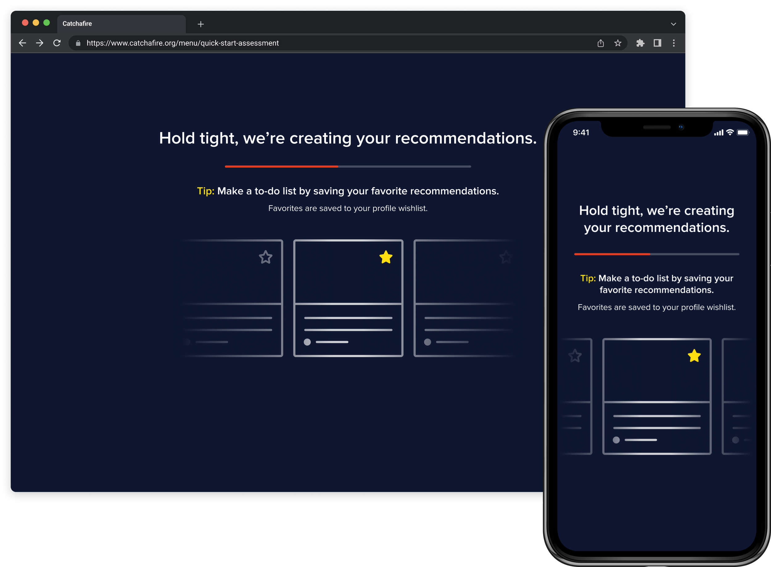
Loading the recommendations
This intermediary screen was an indicator of action to the user, but also served a practical purpose for recommendations that required more time to process.
It was also used as an opportunistic moment for education about the saving and wishlist feature on the platform.
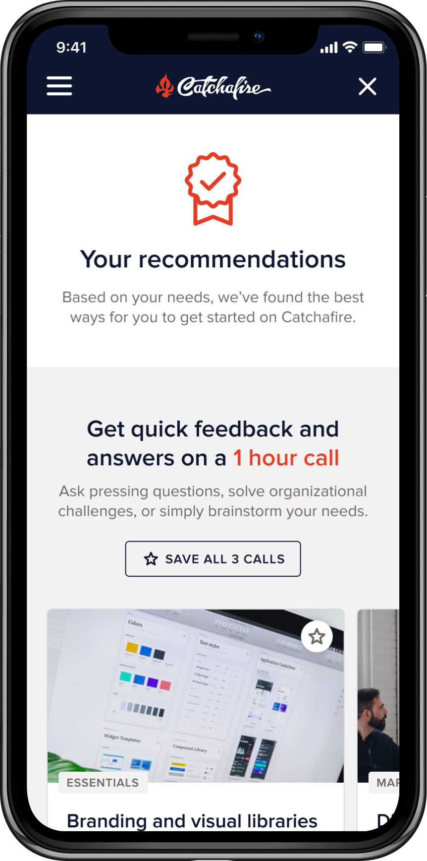
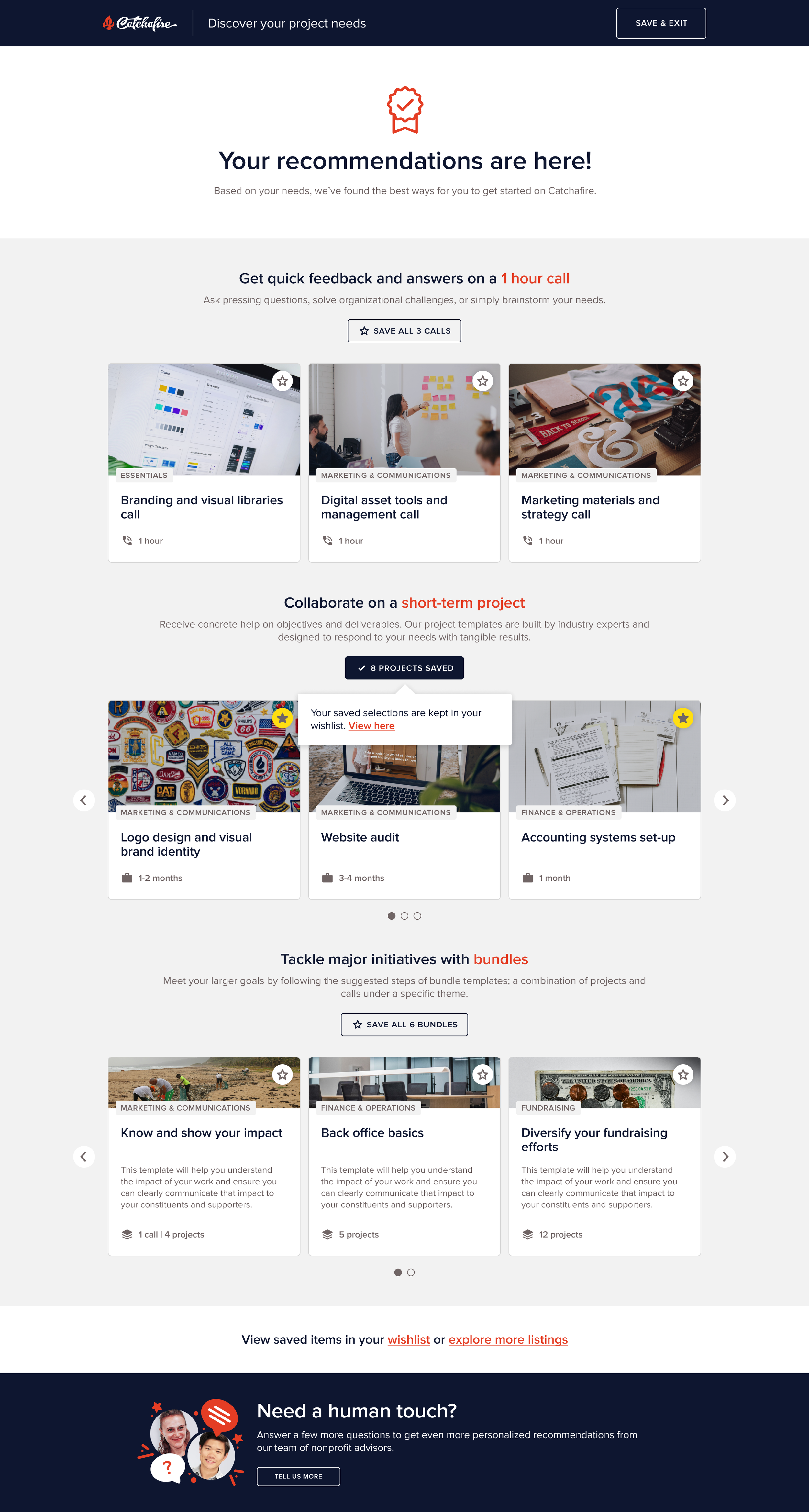
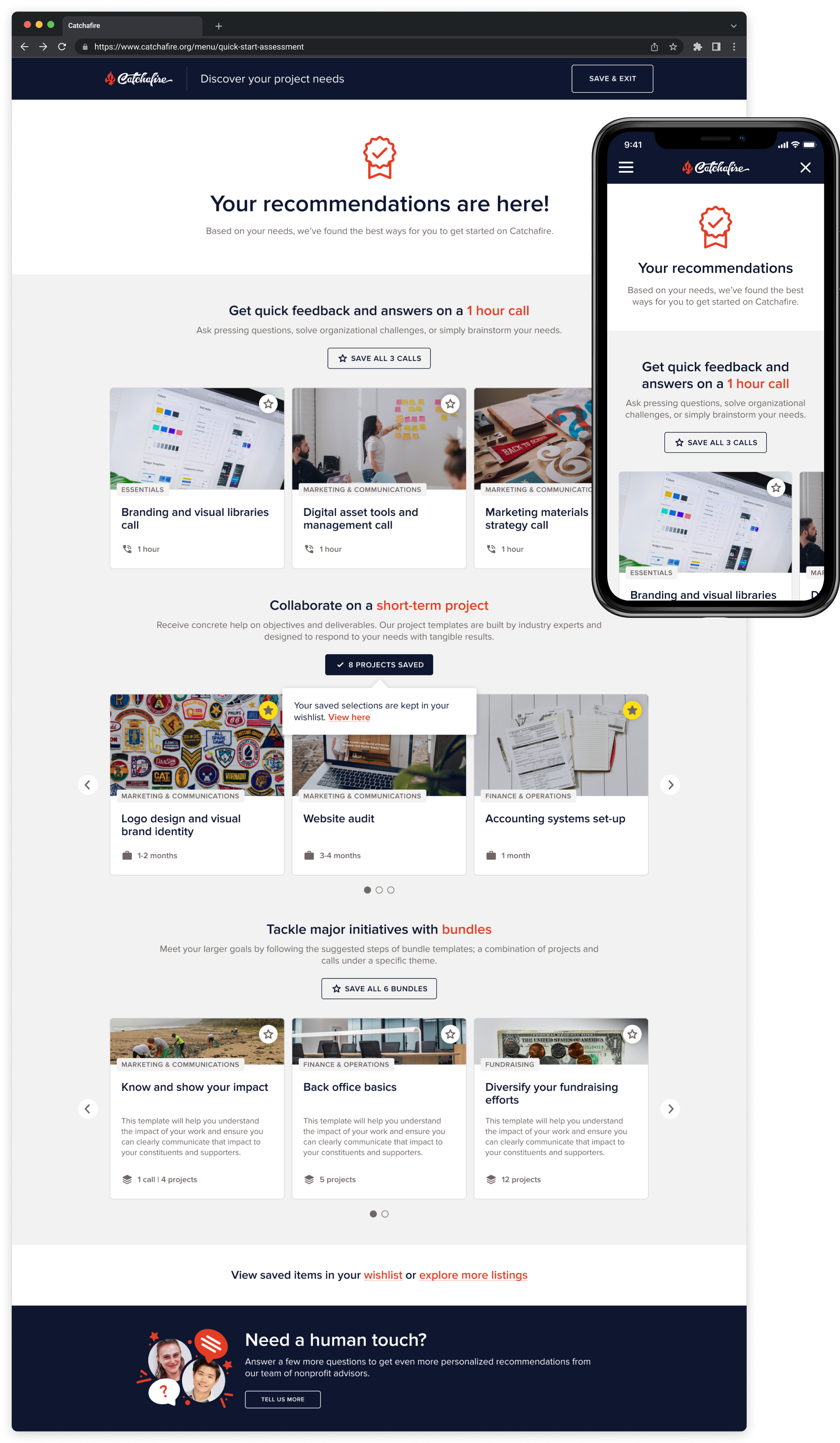
Personalized recommendations list
This list was designed to provide users with tangible next steps to tackling their initiatives, and to help onboard and educate them to the platform’s offerings, taxonomies and features.
DESIGN CONSIDERATIONS:Results were showcased to reflect all the different offering groups on the platform (calls, projects and bundles), and are organized in ascending order of time commitment and level of engagement.
Content and framing was design to be light and easy to digest; in order to clearly communicate each sections benefits and also provide the user with a quality amount of options.
A continued assistance flow was available at the bottom of the page for users who needed additional white-glove guidance, and is an opportunistic moment to highlight the availability and expertise of or in-house nonprofit advisor team.
Additional personalized help
A space for users to get white-glove support and create a connection with our in-house nonprofit advisor team.
This part of the flow was not meant to be utilized frequently, since it would suggest our project algorithm and results were not useful to users.
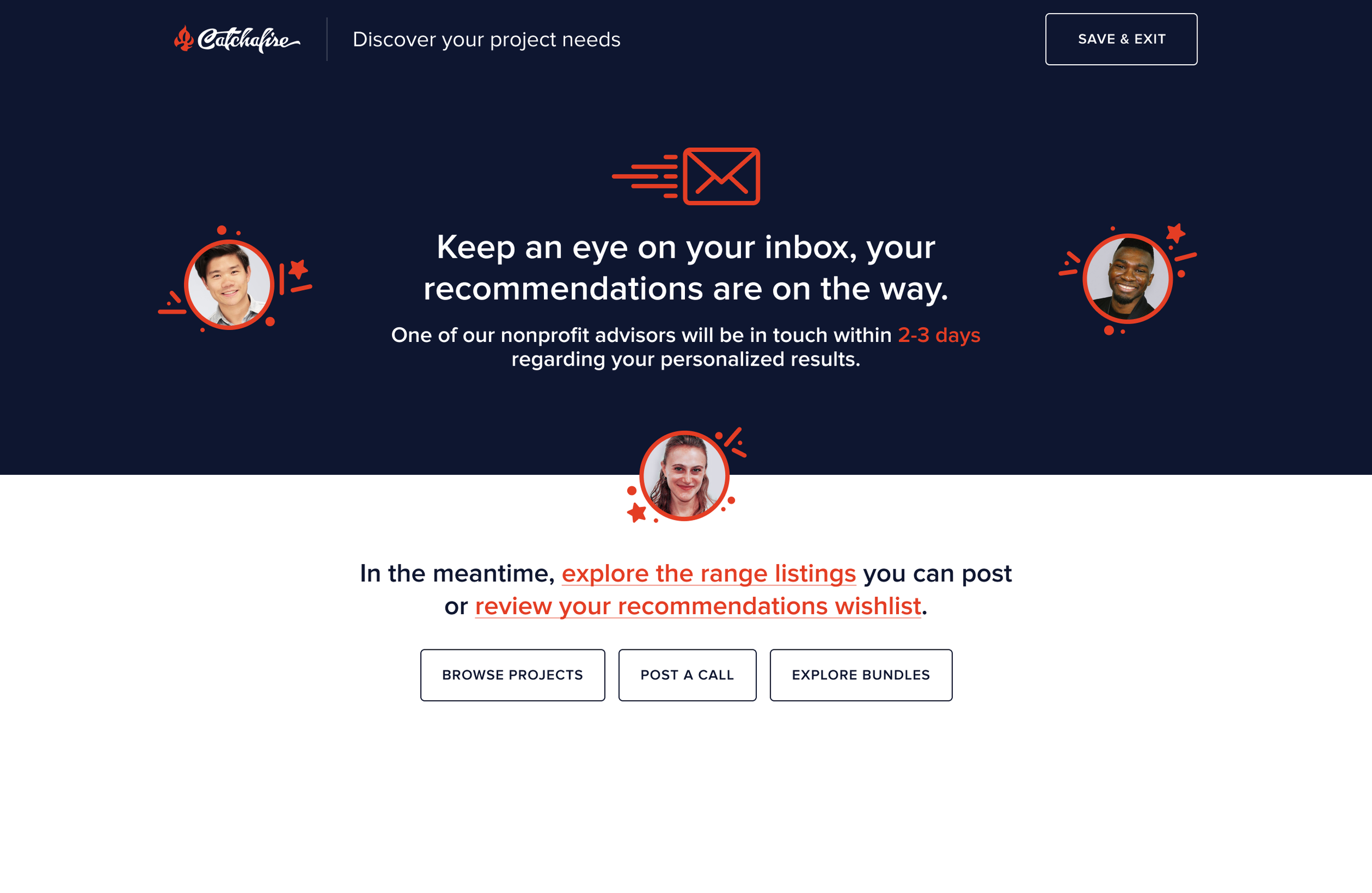
Submission confirmation
DESIGN CONSIDERATIONS:Confirm that answers were received by real people
Clear indicator of when the user would hear back
Relevant CTA’s to continue browsing on the platform and get back to recommendations

Various graphics I created for this project
Step 4: Building it out
During the development process, the tech team and I partnered closely to ensure product quality and functionality.
My responsibilities:Create product design specs
Prior to build, I provided the necessary specifications, annotations and interaction design guidelines to build the design from.
Lead testing QA for all things design
I throughly tested every story in this epic that had a design or experience component and provided any additional guidance or modifications.
Cross browser and device testing
Since we were a web-based product and used across many device mediums, it was critical to review the experience across all platforms.
Zeplin
Product design specifications and annotations
Shortcut (formerly Clubhouse)
Agile work-flow product management
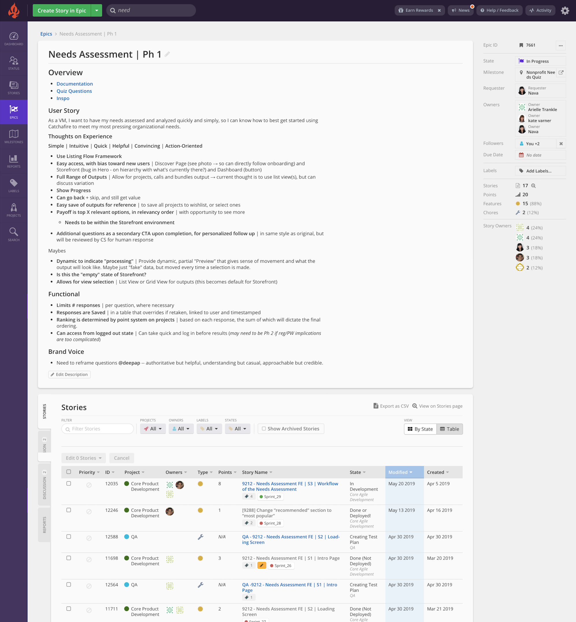
Screenshot of epic board on Shortcut. All stories for this project were organized and tracked from this board.
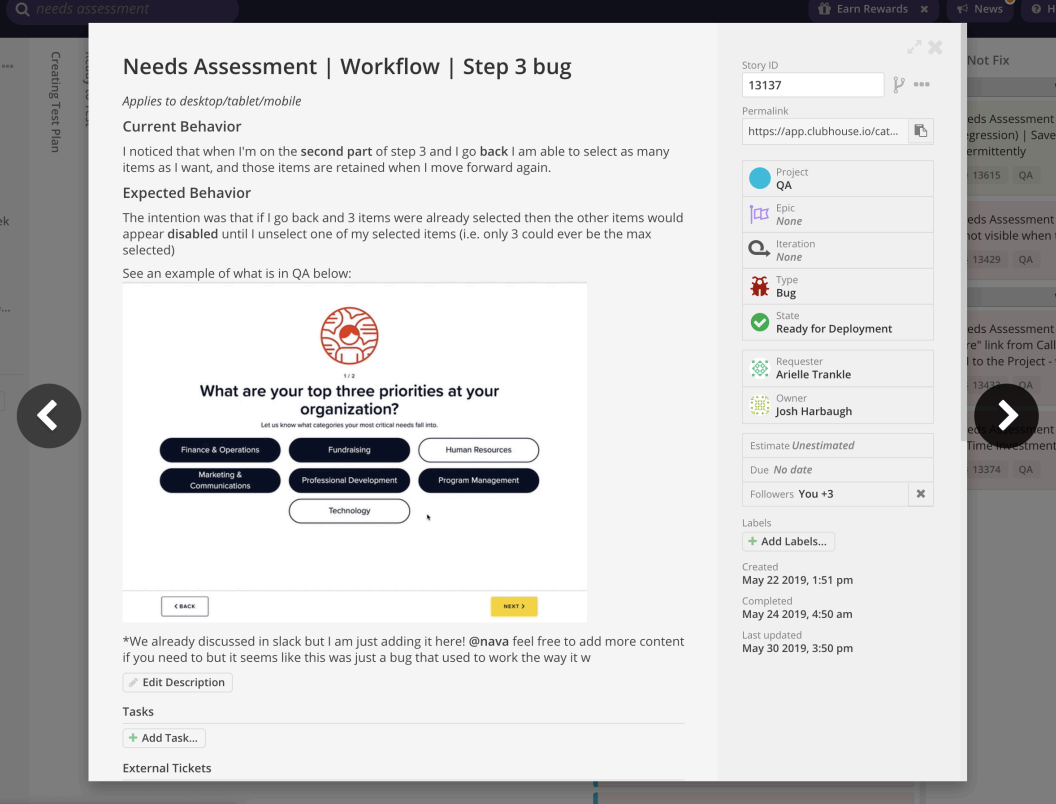
Example screenshots from QA board
Taking a look back on the product design and build process
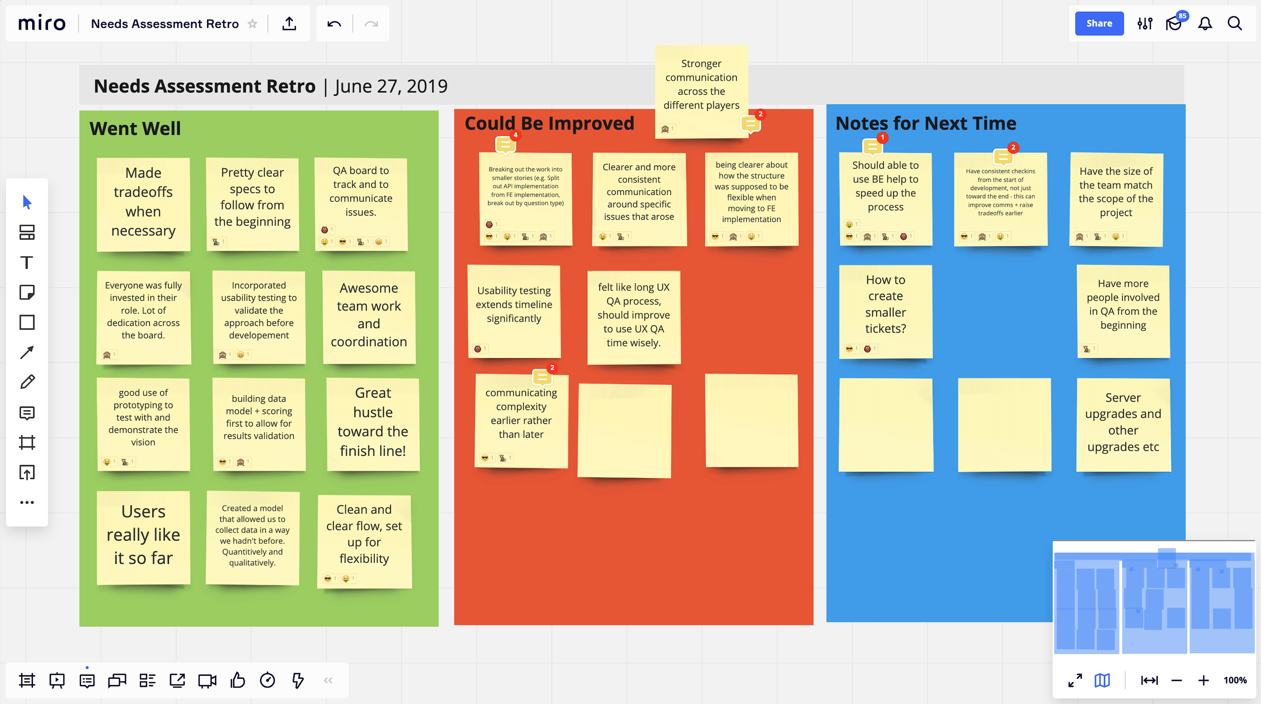
We conducted monthly “Retrospectives” sessions among cross-functional teams within Product, adhering to Agile methodology, to foster continued open communication for improving our processes, collaboration, and communication
Given the scale and significance of this project, we held a dedicated retrospective session. This 1.5-hour workshop was conducted using Miro and Google Meet, to accommodate our remote and international team members.
highlights:Great hustle, dedication and ability to compromise from all team members
Stories should be smaller to make building and testing efforts more digestible
Would have benefited from a consistent check-in cadence for clearer expectations
Engagement metrics
Over 400 volunteer managers took the Quick-Start Assessment within the first 2 months of it’s launch
of users completed the assessment
82%
of users saved listings from their recommendations page
41%
of users posted listings directly from the recommendations page
45%
TOP 3 nonprofit PRIORITIESMarketing & Communications
25.8%Fundraising
24.9%Technology
12.1%
TOP 3 in-demand volunteer SKILlsCommunications
Marketing
Strategy Consulting
TOP 3 recurring initiativesMarketing Strategy
Strategic Planning
Process & Tools
Learnings along the way:
You don’t win the trust of your team without compromise and being able to communicate value trade-offs.
Testing rigorously early in the process greatly de-risks your endeavors, and saves you a lot of headaches and rework.
Dedicate efforts to learning and using cross-team taxonomies, in order to work more effectively and efficiently together.
“The quick-start assessment is a worthy new addition to the way Catchafire benefits nonprofits. Nice work.”
“Just completed the recommendation tool. Loved it! It was quick and easy, and I like how it prioritized projects according to my input. That is valuable to me since I am overwhelmed by the amount of projects I want to complete through Catchafire.”


